How to Mix Watercolors: Limited Palette

I independently review every product I recommend. When you make a purchase through a link, I may earn a small commission at no additional cost to you. Learn more
Table of Contents
A Watercolor Limited Palette Beyond Limits
Welcome to the enchanting world of watercolor painting, where a limited palette can be your greatest ally. Let’s embark on a journey of artistic discovery, exploring how a handful of thoughtfully chosen colors can set your creativity free. We’ll dip our toes into the delicate art of color mixing, revealing why you might not need black paint, and we’ll unlock the unique role of white in watercolor.
The Power of a Limited Watercolor Palette
Unleashing Creativity with Fewer Colors
A limited palette may sound like a constraint, but in truth, it’s an invitation to explore the depths of your creativity. By focusing on a small selection of colors, you not only simplify your choices but also deepen your understanding of pigments, which can lead to more harmonious and captivating artwork.
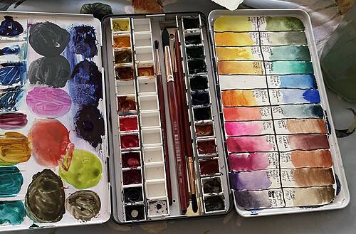
The best, limited watercolor palette for beginners who want to try professional quality pigments has to be Daniel Smith’s Essential Watercolor Mixing Set in my opinion. When I first dove into the wonderful world of professional quality watercolor paints, this was the set I chose.
I researched all of the watercolor brands and although there are many amazing professional watercolor options out there, I chose Daniel Smith Watercolor Paints for their extensive color choices. I love how carefully crafted their descriptions are. As an adventurer at heart (at least in novels) I was captivated by the beautiful explanations that accompanied each color.
However, the frugal homemaker in me wanted to make sure I knew what I was getting into. Professional quality paint can be a bit pricey. When I found the Daniel Smith Essentials Set on Amazon I was so excited! I knew I could afford to get this one set and “Oh My” it was amazing.
Painting with a limited professional quality palette brought me to a whole new level of watercolor painting. The colors were so brilliant! I highly recommend a beginner watercolor artist to try this set out. I am not being paid by Daniel Smith to say this either.
However, as a disclosure: I do earn a commission from Amazon if you use the affiliate link to purchase this set. #ad
I have the Essentials Set with the ground included, however, I saw these other options in case they might be a better choice for you!
Amazon Link to Daniel Smith Essentials Set
Amazon Link to Daniel Smith Essentials Set with Watercolor Ground
Amazon Link to Daniel Smith Half Pan Set
The Limited Watercolor Palette: Colors for the Journey

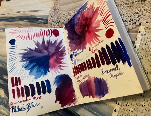
1. French Ultramarine: The Blue of Infinite Depth
Our journey begins with French Ultramarine, a color that captures the essence of deep, boundless oceans. It serves as the cornerstone of your limited palette, offering a range from tranquil blues to mysterious purples.
French Ultramarine leans red so this blue is considered a warm color. ( I know, how is blue a warm color? We will dive deeper into that later)
2. Phthalo Blue: A Vibrant Splash of Color
Phthalo Blue introduces a burst of life to your palette. This vibrant, intense blue has the power to invigorate your artwork, be it in the sky’s expanse or the vivid shades of a garden.
Phthalo Blue leans cool. ( pronounced “fthalo”)
3. Quinacridone Rose: The Elegance of Pink
Quinacridone Rose brings an air of elegance and warmth to your palette. This delicate pink is versatile, offering the ability to evoke tenderness or add a touch of vibrancy to your creations.
Quinacridone Rose leans cool. (pronounced “quinn-ack-rid-own”)
4. Pyrrol Scarlet: A Burst of Red Energy
Pyrrol Scarlet is the energetic heart of your limited palette. It infuses your artwork with the passionate fire of red, making it bold and commanding or gentle and inviting.
Pyrrol Scarlet boasts warmth!
5. Hansa Yellow Light: The Sunshine Hue
Hansa Yellow Light is the radiant sunshine in your palette. This bright yellow exudes warmth and light, giving your artwork a sense of glow and positivity.
Hansa Yellow Light leans cool (One of those conundrums to be explained later!)
6. New Gamboge: A Splash of Gold
New Gamboge adds a touch of luxury to your limited palette. This warm, golden hue conjures the rich tones of a lush garden bathed in sunlight.
As you may have guessed New Gamboge leans warm.
The Art of Color Mixing
Creating a Spectrum from Six Colors
With this limited palette, you possess the power to create an entire spectrum of shades. Experiment with mixing these colors, and you’ll unveil a myriad of possibilities. For instance, by blending French Ultramarine with Quinacridone Rose, you can produce purples of varying depth. Combining Hansa Yellow Light with Pyrrol Scarlet gives birth to vivid oranges, and blending French Ultramarine with Hansa Yellow Light reveals an array of captivating greens.
Warm and Cool Watercolors
I know in school we were taught that Blues, Violets, and Greens are cool colors, while Reds, yellows, and oranges are warm but let me take you out of the paint box and reveal an artist’s secret “It’s not that simple!”
Colors can “lean” warm or cool even if they are traditionally thought of as one way. The undertones in the color might carry a hint of blue or a hint of red that makes that particular color lean to a different side of the spectrum. By learning how to use this knowledge to your advantage you will be able to mix vibrant and muted secondary and tertiary colors without them becoming muddy.
Rethinking Black in Watercolor
1. Mixing Your Own Blacks: A Symphony of Colors
The beauty of a limited palette is the ability to craft your own black. By skillfully mixing your chosen colors, such as a blend of French Ultramarine and Pyrrol Scarlet, you can produce rich, harmonious blacks that seamlessly integrate into your artwork. This approach ensures that the blacks in your painting are alive with the same pigments that exist throughout your composition, creating a sense of cohesion and unity.
2. Creating Depth with Shadow Mixes
While avoiding the use of black paint, you can create deep shadows using a mixture of your palette colors. Experiment with combining the darkest shades of your palette to give depth and dimension to your artwork. These shadows, born from the same palette, contribute to a more harmonious and cohesive composition.
The Role of White in Watercolor
Using the White of the Paper
One of the most distinctive features of watercolor painting is the utilization of the white of the paper itself. Unlike other mediums where white paint is used, in watercolor, the white of the paper shines through the transparent paint to create luminous highlights and subtle gradations of color. Thinking of your canvas as your white will build depth and luminosity in your work.
Embracing the Translucency of Watercolor
Watercolor’s translucent nature allows the white of the paper to shine through, giving your artwork a magical, ethereal quality. It’s through this translucency that watercolor captures the essence of light and radiance, creating a sense of depth that is unique to this medium.
You will have to learn the art of negative painting to get the best of your whites, lights, and highlights in watercolor. Start your paintings by leaving white values unpainted then continue painting from light to dark.
Color Mixing Recipes
Unlocking a World of Possibilities with Color Mixing
With your limited palette, you can craft an astonishing array of colors that breathe life into your artwork. Here are some essential color mixing recipes, unveiling the secrets of creating brown, gray, black, secondary, and tertiary colors using your palette.
Color Mixing Brown:
Achieving rich and earthy brown hues with your limited palette is a delightful process. Here are some color combinations to create different shades of brown:
- French Ultramarine + Quinacridone Rose + Hansa Yellow Light: This combination yields a deep, warm brown with a hint of purple undertones.
- Pyrrol Scarlet + New Gamboge+ Pthalo Blue: Mixing these colors creates a vibrant, orange-brown with a fiery character.
- Phthalo Blue + Quinacridone Rose: Combining these colors gives you a cooler, purplish brown, perfect for creating shadows.
Color Mixing Gray:
Gray tones are invaluable for creating depth and subtlety in your artwork. Use the following color combinations to make various shades of gray:
- French Ultramarine + Quinacridone Rose: This mix produces a delicate, cool gray with a hint of purple.
- Phthalo Blue + Pyrrol Scarlet: Mixing these two colors results in a vibrant, warm gray.
Color Mixing Black:
Creating a rich, harmonious black using your limited palette ensures that your shadows are cohesive with the rest of your artwork. To make black, mix French Ultramarine and Pyrrol Scarlet and New Gamboge. This combination results in a dark, velvety black with a hint of warmth.
Creating Secondary Colors:
Secondary colors are derived from the primary colors in your palette.For example, combining Hansa Yellow Light (yellow) with Quinacridone Rose (red) creates vibrant oranges. Phthalo Blue (blue) mixed with Pyrrol Scarlet (red) results in stunning purples, while Phthalo Blue (blue) combined with New Gamboge (yellow) yields radiant greens.
Crafting Tertiary Colors:
Tertiary colors are created by mixing a primary color with a neighboring secondary color. For example, combining Phthalo Blue (blue) with a small amount of Hansa Yellow Light (yellow) creates a fresh greenish-blue. Blending Quinacridone Rose (red) with a smidge of New Gamboge (yellow) results in a warm, coral-like shade. Mixing French Ultramarine (blue) with Pyrrol Scarlet (red) produces a deep, violet-leaning brown.
These color-mixing recipes will empower you to craft a myriad of hues, adding depth and complexity to your watercolor paintings. By understanding the nuances of your limited palette, you’ll find that your artwork comes alive with the vivid shades of your imagination.
A World of Watercolor Without Limits
In the enchanting world of watercolor, a limited palette becomes your passport to boundless creativity. With fewer colors, you’ll find harmony, depth, and vibrancy in your paintings, discovering the art of color mixing and the magic of white within the delicate translucency of watercolor.
The journey of mixing watercolors with a limited palette is an ever-evolving one. As you explore, experiment, and create, you’ll find yourself continually amazed by the infinite possibilities these few colors offer. So, seize your brushes, let your creativity flow, and watch as your watercolor world comes alive with the vivid shades of your imagination.
I truly hope that this has been a helpful resource that inspires you to dive into the world of watercolor. Whether you choose these colors to get started or pick your very own. I would love to know how your art is coming along with a limited palette.
Here are some more resources for your watercolor journey:
- Watercolor 101: A Splashy Start
- Mastering Watercolor Techniques: Deep Dive
- Exploring Dynamic Water Color Paint: Which Brand to Choose?
- Unraveling Watercolor Paper: A Beginner Guide
- How to Set Up a Watercolor Palette like an Artist
- How to Coptic Bind a Watercolor Journal (From a watercolor paper pad)
I’d love for you to be my companion in this journey, join my newsletter, and let’s walk this journey together as we GROW HOPE!
Until we meet again,
Raeanna
Raeanna
Raeanna loves her home AT FORESTS EDGE. Cultivating life with a big family in America. She is a Watercolor Artist, Writer, Gardener & a Certified Herbalist.